/
Highlight Links Component
ARI Responsive Websites
Highlight Links Component
- Sam Carlson (Deactivated)
Owned by Sam Carlson (Deactivated)
The Highlight Links Component creates a row of one ore more CTA buttons that can be added above the website header, or within another section of the website if preferred. Users can configure the this feature in the following ways:
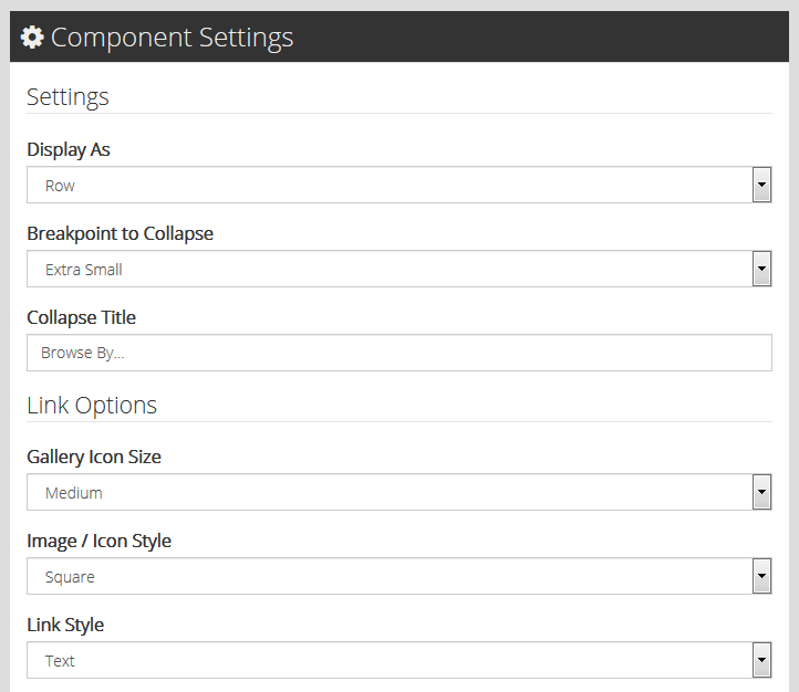
Component Settings
- Display As: This determines how your CTAs will display
- Row: Displays CTAs in a row. This option works well when there are fewer CTAs
- Carousel: Displays CTAs in a carousel view
- Breakpoint to Collapse: This determines how your CTAs will behave for different
- Options are Extra Small, Small, Medium, Large and Never Collapse
- Collapse Title: A customizable, clickable title that displays on your website when the Highlight Links are collapsed
- Gallery Icon Size: The display size of your CTA images (if any)
- Options are Small, Medium, Large and Extra Large
- Image/Icon Style: This adds an optional background to your CTA icons
- Options are No Background, Square, and Rounded
- Link Style: This determines how (and whether) the text links you enter for your CTAs should display.
- Options are None, Text and Button
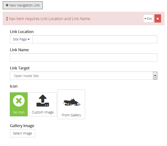
Links
- Add New Navigation Link: This adds CTAs to your Highlight Links
- Link Location: Enter a site page or a custom URL
- Link Name
- Link Target: Enter the applicable URL
- Icon: Options are No icon, Custom Image and From Gallery
- Sequence/Edit Current Navigation Links: Once more than one Navigation Link has been entered, users can drag and drop sequence the order in which they will display on the website.
, multiple selections available,
Related content
CTA Component
CTA Component
More like this
Primary Navigation Component
Primary Navigation Component
More like this