ARI Responsive Websites
What is Responsive Design?
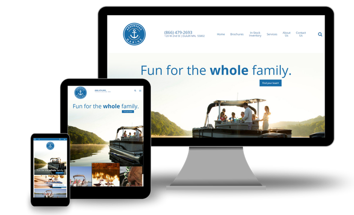
Responsive Design is a method of building web pages that uses flexible layouts, optimized images, and cascading style sheet media queries to control how content is displayed across various screen sizes (smartphone, tablet, computer, etc.).
The primary purpose behind this method is to provide the best website experience to as many users as possible. More than 60% of online traffic comes from mobile devices, and that number grows as more internet-connected devices (such as wearables like smart watches) are released into the market.
Responsive Design provides substantial benefits, including...
- Optimization: Regardless of your page layouts and your content, your website is optimized for all view ports (aka screen sizes) and orientations (portrait versus landscape). Smartphone, tablet, desktop, and smart TV users see your online business represented in a consistent, professional manner. This includes using responsive images for mobile users, which increases page speed and decreases data usage.
- User Experience: Because responsive websites are accessible to a larger pool of users than a non-responsive website, this will typically translate to a better shopping experience, increased leads, and return visits.
- Efficiency: The days of managing both a desktop site and a mobile site are behind us. You enter your content once, and the responsive framework renders your flexible web pages.
- Google Recommended: Google states that responsive web design is its recommended mobile configuration, and even goes so far as to refer to responsive web design as the industry best practice.